


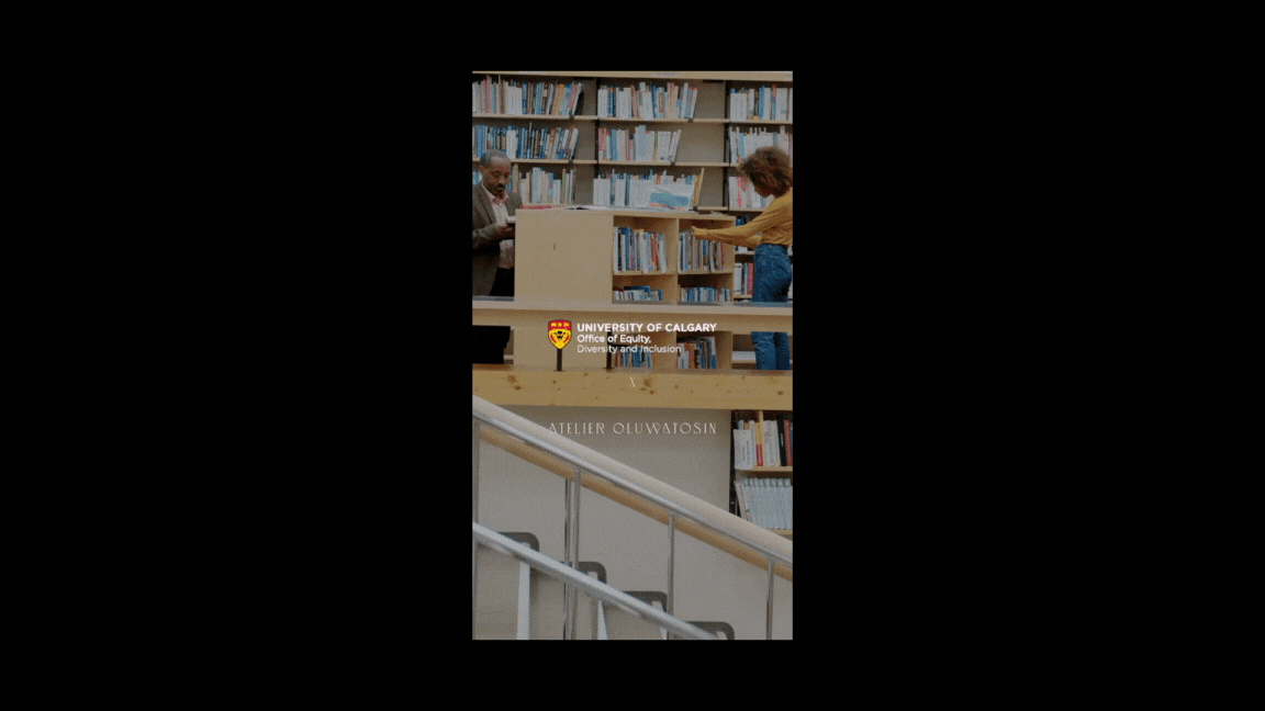
University of Calgary Office of Equity, Diversity, and Inclusion
THE ASK
Create a recognizable and distinct visual identity for The University of Calgary’s Office of Equity, Diversity, and Inclusion that refutes problematized icons while remaining compliant with UCalgary brand standards.
THE RESPONSE
Our design process involved experimenting with free-flowing shapes and lines. The reading of the images is inclusive and universally applicable without leaning too hard into traditional identifiable markers such as skin colour. Symbols of unity, inclusion, and intersection were heavy inspirations for the creation of all the elements of this project. This process created a set of beautiful minimalist and abstract images. We applied the same approach in the design of the website iconography, which you can see examples of in the photo above. A vital component of this process was including UCalgary’s colours in the graphic elements. The resulting imagery is free of gender, skin tone, and other identifying attributes, except when referencing historical figures.


IMPACT
Developed a comprehensive diversity and inclusion visual strategy, positioning UCalgary as a leader among Canadian universities in fostering multicultural engagement.
Boosted student satisfaction and belonging, with a reported 15% increase in positive responses related to campus inclusivity in post-project surveys.
Elevated brand visibility through targeted campaigns, reaching over 100,000 impressions across social platforms within the first month of launch.
Fostered key stakeholder partnerships, resulting in expanded engagement with historically underrepresented student groups.
Successfully aligned the university’s diversity initiatives with broader national conversations, positioning UCalgary for future growth in diversity-focused academic programs.
CREDITS
Graphic Design: Atelier Oluwatosin
Web Development: UCalgary Comms
Atelier Oluwatosin Team: Anjay Seabrook, Tosin O Hoskins
UCalgary Team: Dr. Malinda Smith, Tracy E. Garrick